


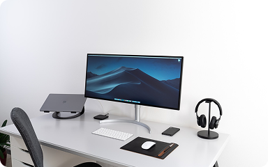


Linear helps streamline software projects, sprints, tasks, and bug tracking. Here’s how to get…
Introduction to Wireframing and its Principles. Learn from the best in the industry.
A grid system is a design tool used to arrange content on a webpage. It is a series of vertical and horizontal lines that create a matrix of intersecting points, which can be used to align and organize page elements. Grid systems are used to create a consistent look and feel across a website, and can help to make the layout more visually appealing and easier to navigate.
If you’ve been to New York City and have walked the streets, it is easy to figure out how to get from one place to another because of the grid system that the city is built on. Just as the predictability of a city grid helps locals and tourists get around easily, so do webpage grids provide a structure that guides users and designers alike. Because of their consistent reference point, grids improve page readability and scannability and allow people to quickly get where they need to go.
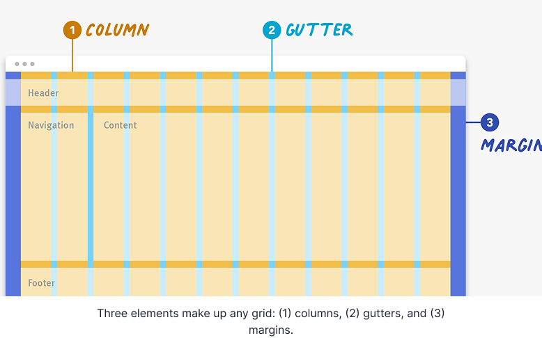
Definition: A grid is made up of columns, gutters, and margins that provide a structure for the layout of elements on a page.
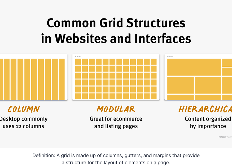
There are three common grid types used in websites and interfaces: column grid, modular grid, and hierarchical grid.
Column grid involves dividing a page into vertical columns. UI elements and content are then aligned to these columns.
Modular grid extends the column grid further by adding rows to it. This intersection of columns and rows make up modules to which elements and content are aligned. Modular grids are great for ecommerce and listing pages, as rows are repeatable to accommodate browsing.
Hierarchical grid: Content is organized by importance using columns, rows, and modules. The most important elements and pieces of content take up the biggest pieces of the grid.
Breaking Down the Grid
Regardless of the type of grid you are using, the grid is made up of three elements: columns, gutters, and margins.
Columns: Columns take up most of the real estate in a grid. Elements and content are placed in columns. To adapt to any screen size, column widths are generally defined with percentages rather than fixed values and the number of columns will vary. For example, a grid on a mobile device might have 4 columns and a grid on a desktop might have 12 columns.
Gutters: The gutter is the space between columns that separates elements and content from different columns. Gutter widths are fixed values but can change based on different breakpoints. For example, wider gutters are appropriate for larger screens, whereas smaller gutters are appropriate for smaller screens like mobile.
Examples of Grids in Use
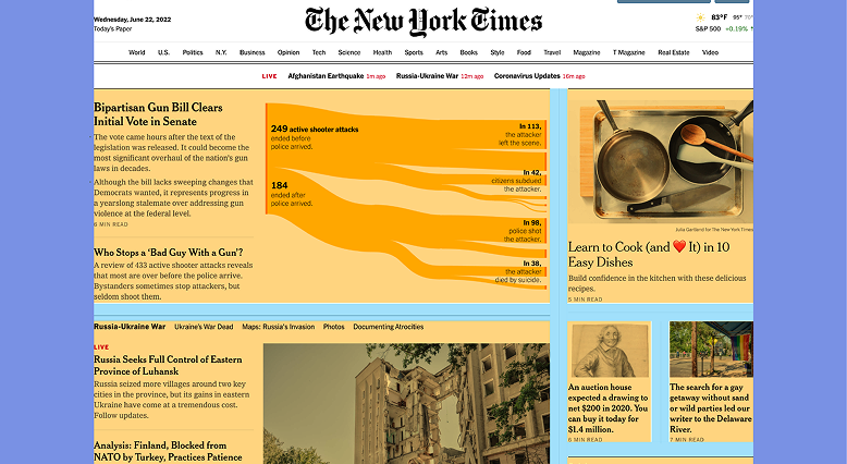
Example 1: Hierarchical Grid
Our first example is from The New York Times. This screen utilizes a hierarchical grid to create a newspaper-like reading experience. At desktop screen size, two main columns make up the hierarchical grid. The most important news story takes up the most space in the grid, the left column, followed by secondary and tertiary stories, which take up the smaller column and modules on the right.
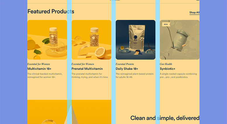
Example 2: Column Grid
Our second example is from Ritual.com, a vitamin company. This design uses a column grid to create an attractive visual experience. At this screen size, four consistently sized columns make up the grid structure and elements are aligned to and within these columns. The gutters, the spaces in between the columns, are also consistently sized and help the user visually separate the different products. The margins are independently sized and are the same between the left and right sides.