


A grid system is a design tool used to arrange content on a webpage. It is a series of vertical and horizontal lines that create a matrix of intersecting points, which can be used to align and organize page elements. Grid systems are used to create a consistent look and feel across a website, and can help to make the layout more visually appealing and easier to navigate.
If you’ve been to New York City and have walked the streets, it is easy to figure out how to get from one place to another because of the grid system that the city is built on. Just as the predictability of a city grid helps locals and tourists get around easily, so do webpage grids provide a structure that guides users and designers alike. Because of their consistent reference point, grids improve page readability and scannability and allow people to quickly get where they need to go.
Definition: A grid is made up of columns, gutters, and margins that provide a structure for the layout of elements on a page.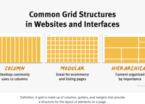
There are three common grid types used in websites and interfaces: column grid, modular grid, and hierarchical grid.
Column grid involves dividing a page into vertical columns. UI elements and content are then aligned to these columns.
Modular grid extends the column grid further by adding rows to it. This intersection of columns and rows make up modules to which elements and content are aligned. Modular grids are great for ecommerce and listing pages, as rows are repeatable to accommodate browsing.
Hierarchical grid: Content is organized by importance using columns, rows, and modules. The most important elements and pieces of content take up the biggest pieces of the grid.